As in all other photography types, the image’s composition is of the utmost importance in landscape photography. Elliot Weston once said: “To compose a subject well means no more than to see and present it in the strongest manner possible”. So, let’s look at how we can put composition in landscape photography into practice.
Know the rules / break the
rules about composition in landscape photography
A lovely landscape does not automatically mean a good photo. Taking a good photo seems like an art, but creating a good composition is a gift one can develop. A few tricks can help you on the way.
In better landscape photos, there are usually common characteristics: location, timing, light and composition. The basic rules for a good composition are well known: apply the golden section or rule of thirds, ensure leading lines, a ‘point of interest’ and create depth by using a subject in the foreground. These rules are there for a reason. By applying them, we consider how people look at a photo. In this way, one can create a sense of proportion, balance and harmony for the viewers. Applying rules should become automatic without thinking about it for a long time.
Edward Westen said, “Now, to consult the rules of composition before making a picture is a little like consulting the law of gravitation before going for a walk. Such rules and laws are deduced from the accomplished fact; they are the products of reflection . . .”
According to Ansel Adams, a photo can just as well be successful by intentionally or unknowingly ignoring several rules. Edward Weston added, “There are rules, and we endure them whether we want it or not, and these result from a lot of thinking.” Before breaking the rules, I believe knowing or understanding some of the rules is essential.
These rules are even more critical when the location or circumstances are less spectacular. So, I use them as a starting point for a photo. I return to this later when you can safely break these basic rules. After all, you are still the artist who decides how you want to capture the landscape, and there are no fines for breaking the rules. But on the other hand, respecting the rules increases the chance that the viewer will find the image beautiful or balanced. I see these so-called rules more as “guidelines”.
Master Ansel Adams again put all this in perspective when he said, “There are no rules for good photographs. There are only good photographs.”
Framing and composition in landscape photography
“Framing” with trees, bridges, arches, gates, etc., creates a “see-through effect” that can help attract attention to the focal point of your landscape image. This also helps place the image in a certain context, as the viewer is then told that the image is part of a historical context, natural environment, etc. Moreover, it gives additional depth and, like lead-in lines, leads the eye to the main focal point.
Gary Winogrand once said, “Photography is about discovering what can happen in the frame. When you put four edges around some facts, you change those facts.”
The edges around the frame are essential in the composition because they also define what fits into the frame and how the elements relate. The art of reduction cannot be underestimated. The fewer objects or elements in a picture, the more impact they will have. Concerning this point, I invite you to read my blog on minimalism.
The boundaries of your frame depend on what you decide to include or exclude from your picture. When focusing on a particular object, unwanted elements sometimes pop up within the framework or vice versa. Essential elements are also frequently not sufficiently present in the image. Some subjects might also need breathing or negative space to avoid being stuck to the frame.

Perspective and foreground (focal point)
Finding the right spot may be as simple as spending a few minutes walking around the location. Look at your landscape from all possible viewpoints and move left, right, up, or down. Try using different elements in the foreground. If necessary, take a few test shots until you are happy with your angle and frame.
As mentioned in a previous blog, a photo is a two-dimensional representation of a three-dimensional reality. Therefore, perspective is one of the features that can make a photo particularly fascinating.
Two types of perspectives can be distinguished.
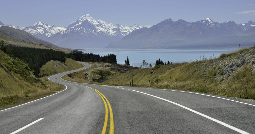
The first is the perspective obtained by elements in the image that suggest distance: something big in the foreground, something small in the background. It is often better to place a subject in the foreground to create the illusion of depth and increase the perspective effect. That can be a tree, a rock, or a wall. But people can be used for the same purpose. In that case, moving closer to the subject in the foreground is necessary. It is up to the photographer to investigate the best options before taking the photo. All photos need some focal point. A landscape without a focal point often seems relatively empty and allows the eye of the viewer to wander over the photograph. Focal points can take various shapes in landscapes, buildings, structures, striking trees, boulders, rocks, silhouettes, etc. It is not only essential to look for a point of interest or focal point. It is also important where you place it in the image. The rule of third parties can offer great help.
Another perspective is the atmospheric perspective: the further image elements are towards the horizon, the more blurred they are. This beautiful fact in landscape photography can produce stunning images, especially when specific layering can be used. Just think of mountains that lie one behind the other. The rear ones appear more blurred than the front ones.
One can emphasise the perspective while changing one’s viewpoint’s height (higher or lower). It is essential to find a balance between foreground and background without overemphasising the focal point in the foreground. A lot of intuition will help you in this case.
Whether you like it or not, the eye is always drawn to the lightest point of the image. It would be best if you try to use this to your advantage. If the brightest spot is not the focal point you want people to look at, you might face a problem. Either you reframe your image, or you should try again at another time under different lighting conditions. In very bright pictures, darker spots can have the same effect.
Your focal point should catch your eye as being the sharpest or lightest point or a specific colour patch in the image.
Lead-in lines in the composition of landscapes
The lead-in lines in several landscapes will hopefully lead the eye to the point of interest and add to the perspective. These lead-in lines include streams, paths, rocks, hedges, darker pave stones, shadow lines, etc. They can go straight to the point of focus or meander in an S-shape like a snake in that direction. This works best when working with a longer lens to compress the image.
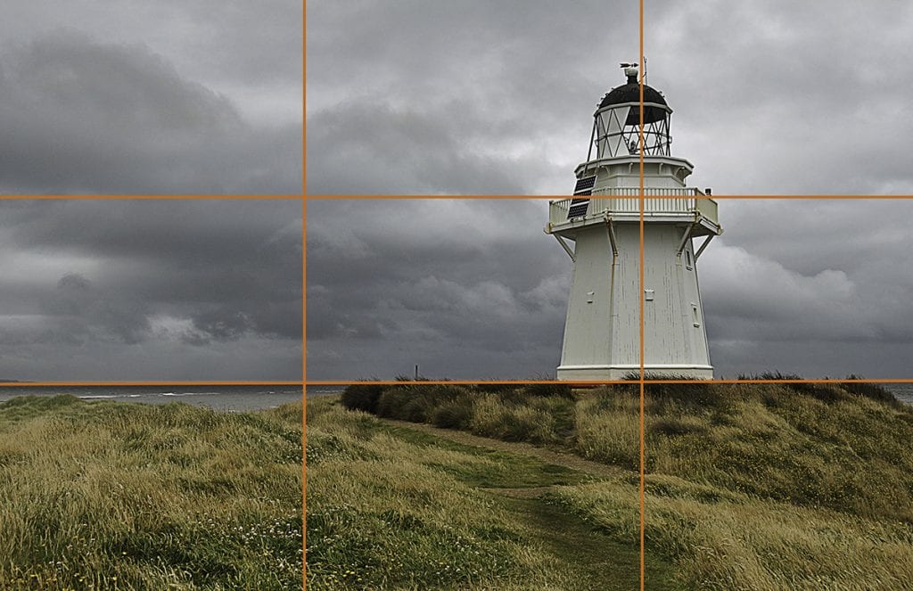
Golden section / Rule of Thirds in the composition of landscape photography
A well-known rule from painting and photography is the “golden section” or “golden mean”, already used in ancient art and architecture. Most of us simplify this as ‘the Rule of Thirds, ‘ which is much easier in the field. The concept is simple: divide the image into a 3×3 grid by lines. The essential image elements are placed at the intersections of these lines. In the case of a landscape shot, for example, the horizon is at 1/3 from above, and the main subject in the foreground is at 2/3 from the left and 2/3 from above. This gives a balanced composition. But do not stick to rules because they limit photographic freedom. Only use them when the picture is better and they are effective.
It is assumed that this mathematical relationship is the closest to the human perception of aesthetics. An essential advantage of this rule is that it keeps us away from the natural reflex of many to put the most crucial element in the image right in the middle of the composition. Moving the focal point from the centre gives you a more dynamic image, better environmental placement, and a broader context. Such placement allows the viewer to see other elements that can improve your main focal point.
It is wise to examine different points of view: often, another point of view is more likely to give a better result. Composition rules can help with this, but they also use the properties of colour, shape, and line to make optimum use by choosing the most suitable lens. At the same time, it is, again, not an absolute rule. Some compositions work better if the object is central. This is undoubtedly the case when symmetry plays an important role and is also often used in the case of reflections.
Patterns in composition in landscape photography
Patterns already present in the landscape, such as lead-in lines or image layering, will help you. Patterns are often present in agricultural landscapes because of human impact, on beaches, or even in woodland.
You can make appealing landscape photos without a focal point when the pattern is strong enough.
Contrast and colour can help structure your image, and repetition will help guide the eye. Examples are poles, trees, houses, etc.
Leave your comment
I have written my thoughts here, but I also want your comments. So please feel free to leave your thoughts here. Even if you disagree with me, just let me know.
Leave a reply